
Everyone has seen a lot of great content on how to best utilize PowerPoint, and some of the “best ways” to make your presentations stand out. It’s not as common, however, to see content focused on what NOT to do in relation to common pitfalls that a consultant can experience when preparing for a client presentation. We wanted to put together a list of some of the top PowerPoint Don’ts from a consultant’s perspective, and also provide how to avoid those pitfalls to create great content for your client.
Do you have some PowerPoint pet-peeves or best practices that you would like to share with us? We would love to feature more in upcoming editions.
The Consultant’s List of PowerPoint Do’s & Don’ts:
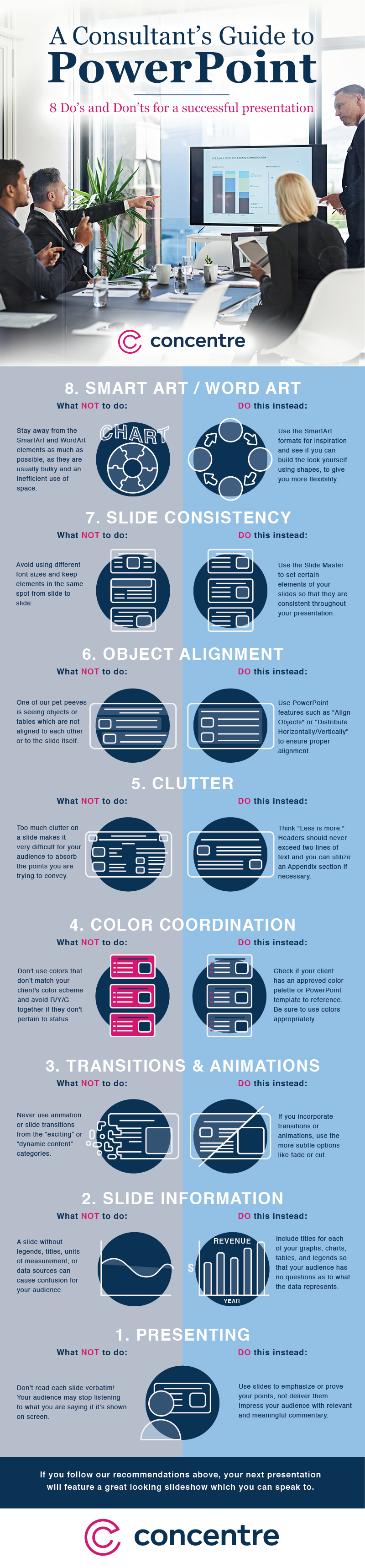
8. SmartArt / WordArt
- What Not To Do:
- PowerPoint provides a lot of built-in “art” for you to use. In our opinion, try and stay away from the SmartArt and WordArt elements as much as possible, as they are usually bulky and inefficient with space they take up.
- Do This Instead:
- Use the SmartArt formats for inspiration and see if you can build the look yourself using shapes. This ultimately gives you more flexibility with the look and feel.
7. Slide Consistency
- What Not To Do:
- Avoid using different font sizes for headers and bodies of text from slide to slide. Logos, footnotes, footers, titles, and other elements which are on multiple slides should be in the same spot (i.e. if you have a logo in the bottom right corner, it should be in the same spot throughout the deck).
- Do This Instead:
- Use the Slide Master to set certain elements of your slides so that they are consistent throughout your presentation.
6. Object Alignment
- What Not To Do:
- Whether it’s an image, text, or table…one of our pet peeves is seeing objects which are not aligned to each other or to the slide itself.
- Do This Instead:
- PowerPoint has some great features which help you to align elements/objects. The “Align Objects” (Top, Bottom, Middle, Center, Left, & Right), along with “Distribute Horizontally/Vertically” are some of the most powerful tools someone can learn. Use them!
5. Clutter
- What Not To Do:
- Real estate is valuable! Too much clutter on a slide makes it very difficult for your audience to absorb the points you are trying to convey (i.e. when a picture doesn’t add value to a slide or including a three-line header).
- Do This Instead:
- Think “Less is More” for PPT. If you find that you are making a header smaller to fit the text onto 2 lines, it probably means that there is an opportunity to shorten the headline itself. You can also reduce clutter by creating an Appendix section at the end of the deck where you can stash a lot of those content-heavy slides to reference later.
4. Color Coordination
- What Not To Do:
- Don’t use colors that don’t match your client’s color scheme. The last thing you want is to use a color palette which is similar to their competitor! Avoid using the color red, other than to highlight something. Also, avoid using R/Y/G on your slides together if they don’t pertain to status (i.e. project status updates).
- Do This Instead:
- Color is a great element to have incorporated into your presentation. It can be used to differentiate data sets, call out observations, and focus your audience on what you want them to see. Check and see if your client has an approved color palette or PowerPoint template to reference. Be sure to use colors appropriately.
3. Transitions & Animations
- What Not To Do:
- Never, ever use animation or slide transitions from the “exciting” or “dynamic content” categories. We believe PowerPoint included these “exciting” transitions and animations for a reason — however, that reason will almost never align with a business presentation. Just don’t do it!
- Do This Instead:
- If you have to incorporate transition or animations (and there are certainly valid times to do so!), try using some of the more subtle animations (fade or cut work well).
2. Slide Information
- What Not To Do:
- As a Consultant, many of your decks will certainly include graphs, charts, and tables. A slide without legends, titles, units of measurement (are we measuring in $ or hours or what?), or data sources just causes confusion for your audience.
- Do This Instead:
- Always include titles for each of your graphs, charts, and tables, along with legends so that your audience has no questions as to what the data is supposed to represent.
1. Presenting
- What Not To Do:
- Don’t make an audience re-hear what they may have already read. Your audience may stop listening to what you are saying if you are reading verbatim.
- Do This Instead:
- Use slides to emphasize or prove your point, not deliver it. If you follow some of our recommendations above, you should have a good looking slide which you can speak to!